Imagine that you are at a restaurant and you have ordered your all-time favorite Tom Yum soup. You just can’t wait to have it and the soup arrives at the table. Finally some delicious food! But you look down and there’s no spoon, Aha! How do you taste the soup?

This is a classic example of a non-intuitive design. It essentially steals the user’s focus when he/she was trying to taste the soup and was interrupted by an unfamiliar situation i.e. a missing spoon.
The same holds for web designs.As long as a user can effortlessly find the information they want/complete a task without any interruption-everything is good.
The easier it is to use a website, the more people will use it. An integral aspect of this ease-of-use is intuitiveness. An intuitive design will help the user focus on important tasks rather than on elements that are not related to their image. Its primary focus is user experience.
Essentially intuitive design is invisible, it requires no instruction-all you need is your intuition to fully operate it.
From the first command-line interface (CLI), followed by two-dimensional text-user interface (TUI) and finally graphical user interface (GUI), user interfaces have come a long way. If you want to make your product intuitive, here are a few things to consider.
Discoverability is the key
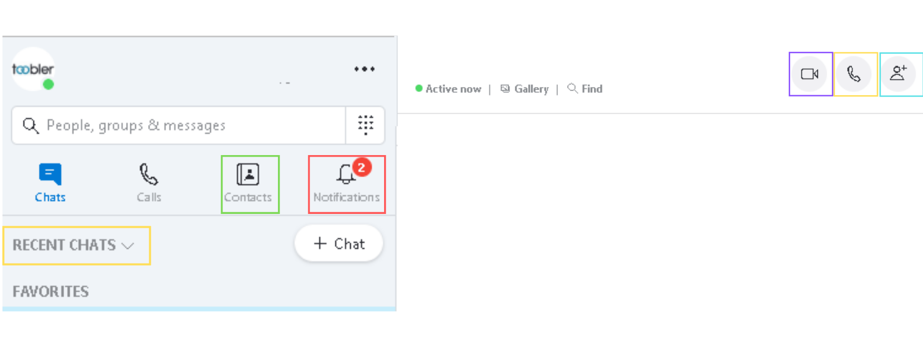
It is essential to make your website content discoverable as it will help the users easily find what they are looking for without any hassles. This will not only improve user engagement but also help in developing user loyalty. For e.g, if we go to skype, all essential features like
Recent chats
Contacts
Notifications
Video call
Audio Call
Create new group
can be easily discovered just at the first glance.

You must know thy users
The best way to build intuitive websites is by understanding your target audience in terms of their current knowledge points, what do they know and what do they want to know? This can be achieved using field studies, interviews and usability tests. These tests will help understand your user’s needs better.
Affordance communicates what users should expect
Don Normanin in his book Design of Everyday Things introduces the notion of affordances in design. It refers to the interface’s visual cues about different elements and how they can be used. A user can easily understand what will happen if they do a particular action. It is intuitive for the user to understand what familiar icons will do in the context of Skype app.
For e.g the bell icon is for notification, the address book icon is for the contacts, etc.

Existing knowledge Vs. Target knowledge
Users come to your website with existing knowledge obtained from their prior experiences. Then there is the target knowledge-what all a user must know to use the product properly. You must build interfaces that minimize the gap between existing and target knowledge. This will help you to create a holistic product that will work intuitively with your user’s existing knowledge.
Intuitive designs are efficient
Intuitive UIs will help people perform actions with minimal effort. Just think about all those apps and websites that make you answer extra questions, see multiple screens before you can actually complete a task. On the other hand, an intuitive UI will not interrupt the flow.
A classic example is Gmail. As I am composing an email, Google is trying to be efficient by completing sentences for me.

Be Intuitive, Be Responsive
When a user performs an action, he/she must know whether the action they performed was successful or not. They should not be left waiting as this will only lead to frustration. An intuitive UI must give immediate feedback regarding the success or failure of an action.
For e.g, when you send an email using Gmail you are immediately notified whether the mail was sent or if it is still in the outbox.

Intuitive designs allow users to make mistakes
Intuitive UI comes with the ability to undo wrong actions done by the user. The best example in this context will be Google.

As you can see above, I have typed the wrong spelling for the word happy into the Google search field but it still gives me the suggestion with the right spelling. It is intuitive for Google to know that “ what I meant was happy”.
Combine all of the above and ta-da you can easily improve the UI and UX of your product with intuitive designs.
/f/122804/1800x676/065345de8a/design-better-with-these-7-intuitive-design-steps.png)
/f/122804/1400x526/6c72da18ed/mobile-app-user-experience.png)
/f/122804/1800x676/1ab6f7424f/html5-developer-conference-1.png)